Iponweb
Iponweb is the leading AdTech company that powers more than 40+ ad platforms across the world.
u-Workflow is a flexible framework that allows Iponweb to build highly customizable UI for clients. It's made up of multiple reusable components and modules that can be applied to a large variety of purposes. Key client segments: DSP, SSP, TV, and Digital Out Of Home. Among client partners are: TrustX, WordPress, DAC, Dish Network, MCN, Experian, True Digital, and many others. More than 40 independent projects have been implemented based on the UI framework.
My role
When I joined the project, the existing framework was covering core use cases, but in an inefficient way. User research has demonstrated that the UI was not clear to clients, and wasn't user friendly. The framework was not consistent – more than 3000 unsystematic components were slowing down growth, blocking development, complicating communication.
My task was to own the UX, fix existing problems, make the framework consistent, user-friendly, relevant to market standards, scalable, and ready to execute feature requests from clients and internal stakeholders in an efficient way.
Product Research
To start my work on the product, I needed to define the profile of the users and the gaps of the existing solution. For that, I have conducted initial research that included:
- Business context: product distribution, place of this product in the wider product offering of the company
- Market research: competitor analysis, best practices, industry standards, solutions available on the market.
- Technical context: defining tech possibilities and limitations.
- Client needs and pain points: client segments and expectations, analysis of existing feedback, survey of clients and other user groups, collecting feedback from internal stakeholders and company managers.
Based on research results, I've identified key problem areas and have created the roadmap of further product development.
Product Process
We have built the product development process to include the validation of each iteration from the business performance perspective. The process was adjusted to save development resources, allowing a fast test of hypotheses.
The process consisted of the following stages:
- Creating a hypothesis or a series of hypotheses;
- Business validation with an internal or external client;
- Prototype: design-only or a fully functional prototype;
- Client feedback analytics;
- Adjustments based on feedback;
- Implementation;
- Result assessment.
Team
Since Iponweb is an engineering-led company, my team was made up of developers. I was leading the team as a Product Owner and provided all designs as well, covering both strategy and implementation.
Case Study
Make Navigation Great Again
Task
Navigating to a specific element inside the framework was one of the core user scenarios. However, the original navigation experience was inefficient: it took a week of training, on average, to learn how to use the navigation inside the product. To add to that, navigation caused negative feedback and support tickets that could be avoided.
Solution
A survey of users and relevant stakeholders has surfaced that users have been spending too much time and mental effort on finding what they wanted.
Our core user was identified as the AdOps specialist. Their efficiency is directly connected with revenue generation through a wide range of AD activities: with DSPs and SSPs, BEEs, and DOOH systems. In their work, they need to switch between different elements and need fast navigation to make their work efficient.
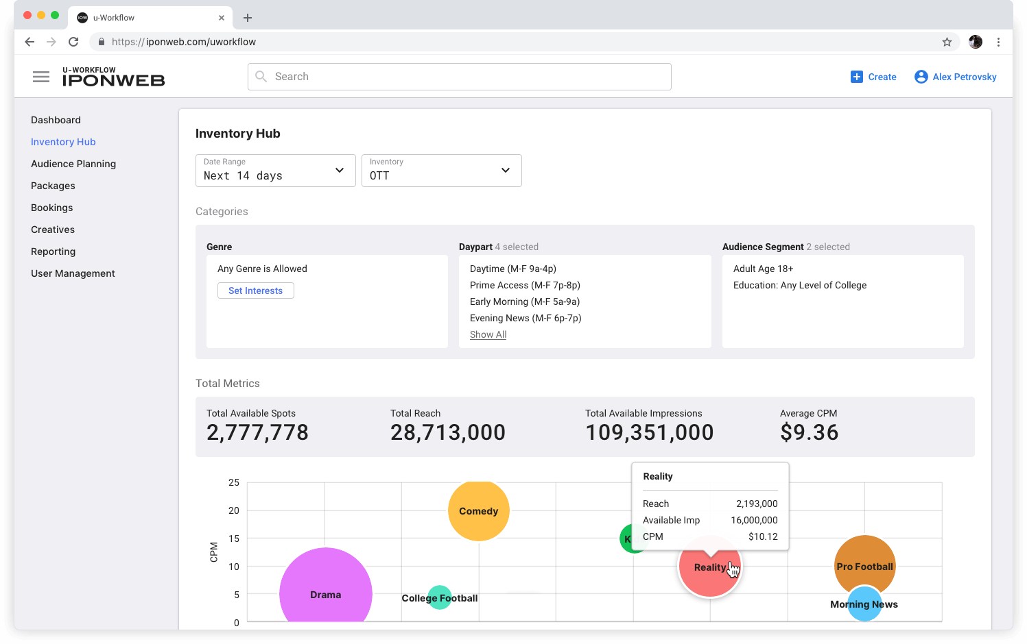
We have identified the ‘root flaw’ of the existing navigation – there was no information architecture behind it, which made it impossible to present system elements in a structured way to the users.
Through creating the information architecture, we’ve been able to structure the resulting navigation into three layers, designed to cover three most common user scenarios:
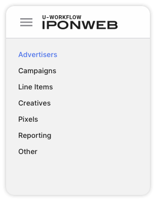
The first layer – fast navigation across high demand queries
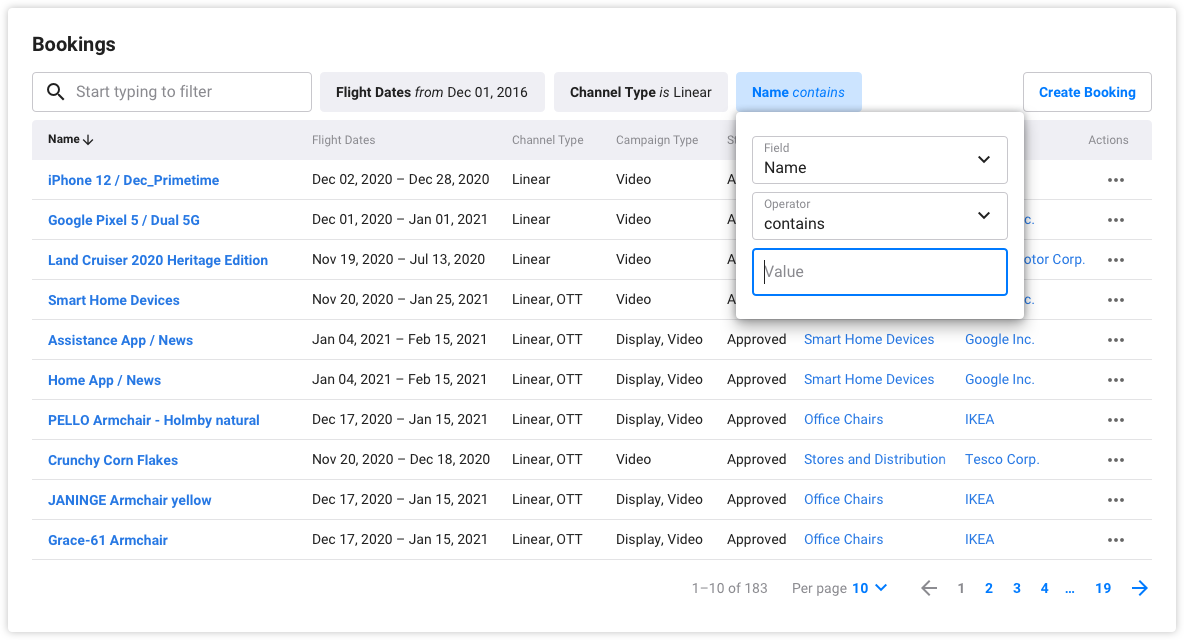
Originally, the navigation was implemented through a search box. It was creating cognitive load on a daily basis and required prior training to use it. We have created the missing information architecture, which has allowed us to transition to a straightforward navigation menu with high demand queries.
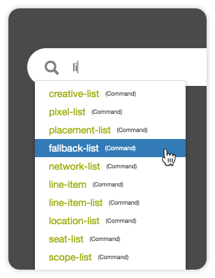
The old way of navigation thru the search input
Fast navigation across high demand queries
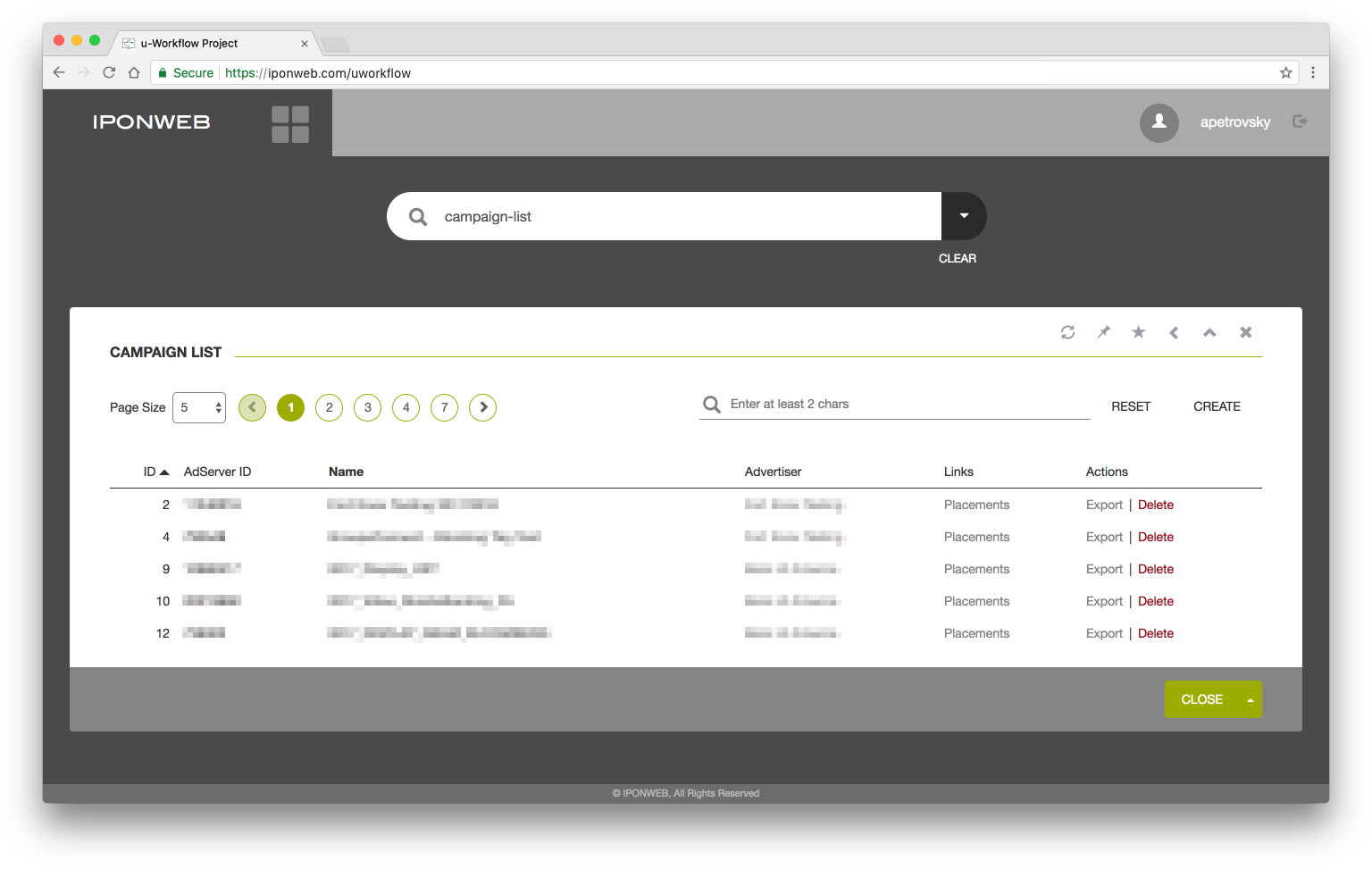
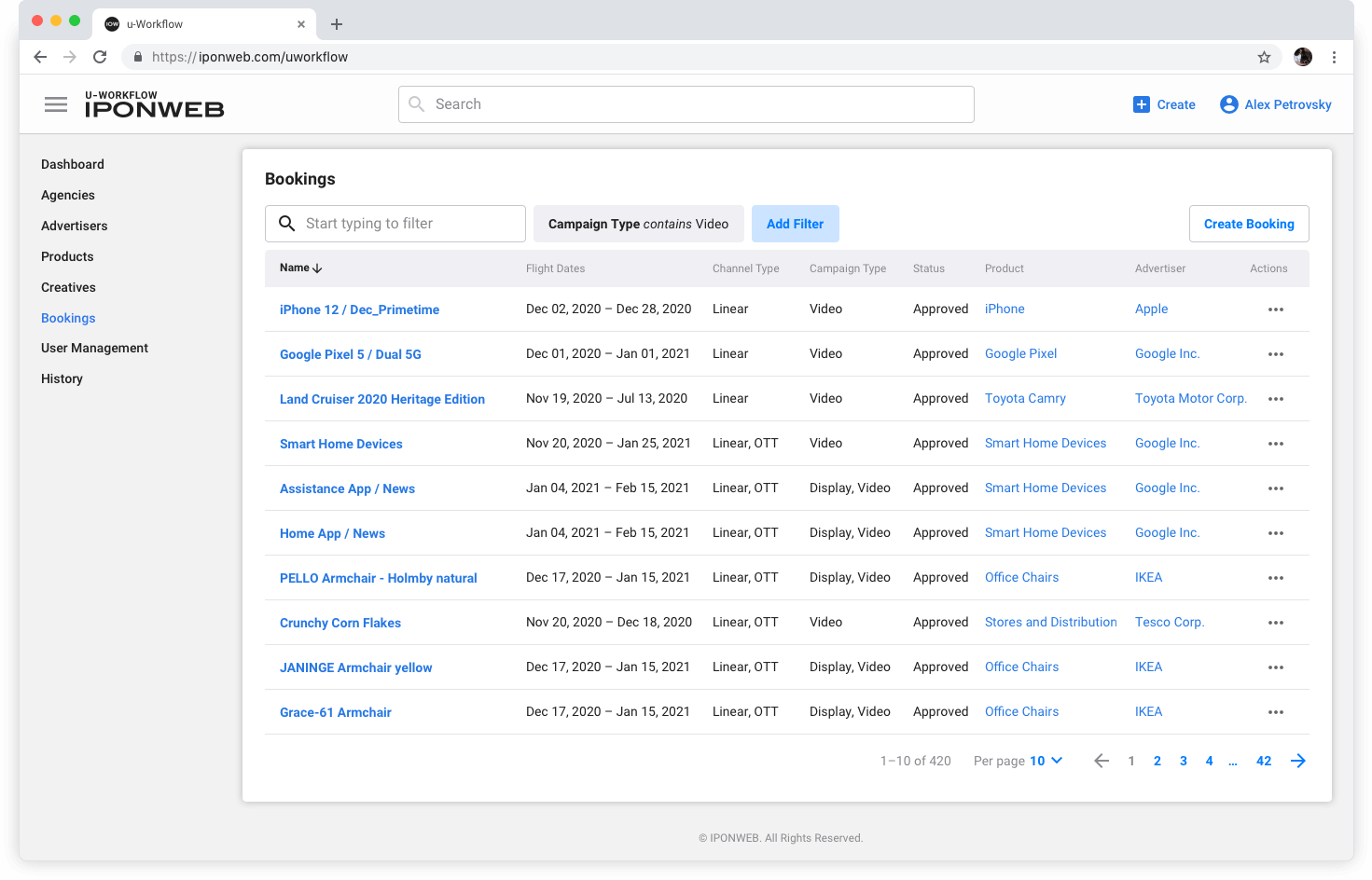
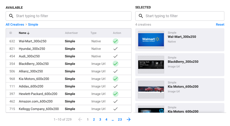
The second layer – search results filters
The existing search results design did not allow the users to navigate beyond the list. As a result, users had to spend a ton of time on finding the item they needed. To solve this problem, we have implemented universal filters that can be used in any combination for any search query. This has allowed to cut the time spent on finding a search result x8.
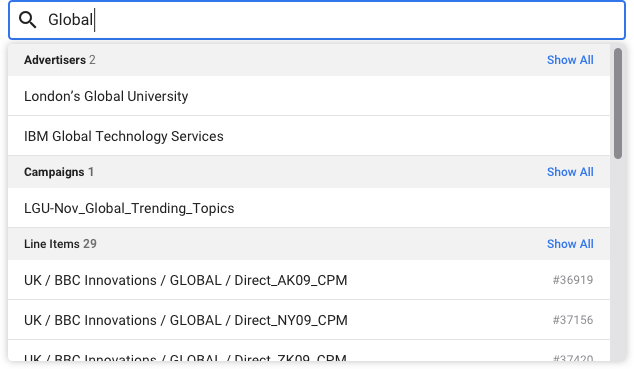
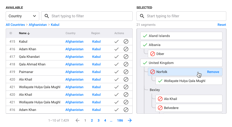
The third layer – guided search UI
To help the users find what they needed faster, we have upgraded the search engine to support the "search weights" of objects. This has allowed us to introduce guided UI across key scenarios, including objects grouped by type.
Result
After testing the new navigation, 91,7% of users have described the new nav as simpler and clearer than the original navigation. 92,9% of users have evaluated the new nav as more preferable. Here’s to quote user feedback: "I used to spend 30 minutes on finding the needed object, now I need one minute".
Case Study
Mending the Data Gap
Problem
Through research, I've discovered that the product didn’t cover a critical step in the user journey – monitoring Ad activity. To track key metrics, users had to switch to other products. This slowed down and complicated decision making for clients, which caused problems that were fatal for certain scenarios.
The Missing Element of the Client User Journey
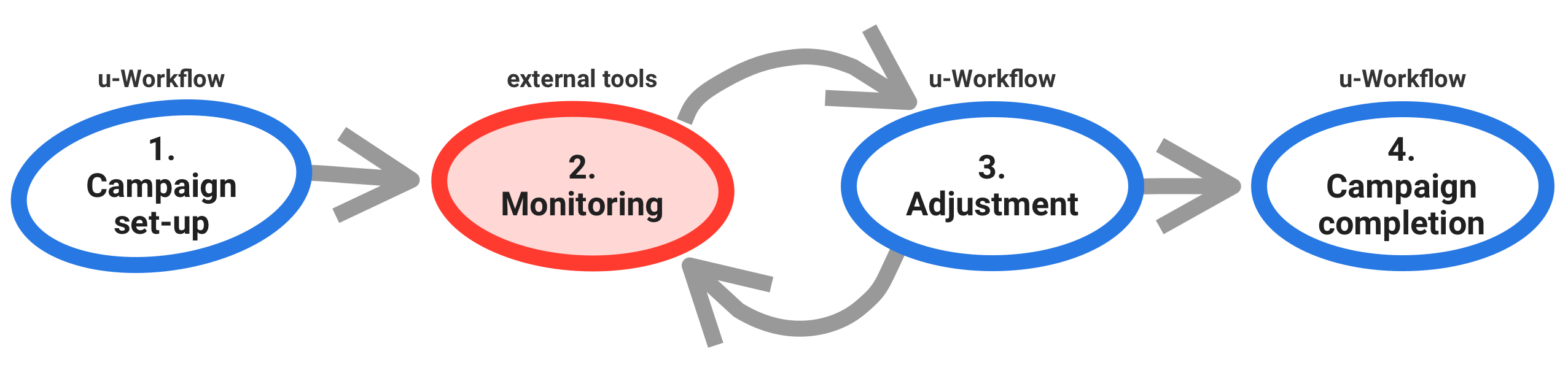
To illustrate this, let’s review one of the most recurring scenarios inside u-Workflow – campaign optimization:
- After the Campaign is started in u-Workflow, AdOps needs to monitor its efficiency. This had to be conducted via external monitoring tools.
- If something goes wrong, they have to go back to u-Workflow to make adjustments to fix the problem.
- On average, this loop would repeat 10 times per month for a single campaign.
Task
Create the missing experience around performance indicators, to enable clients to make data-informed decisions inside the product.
Solution
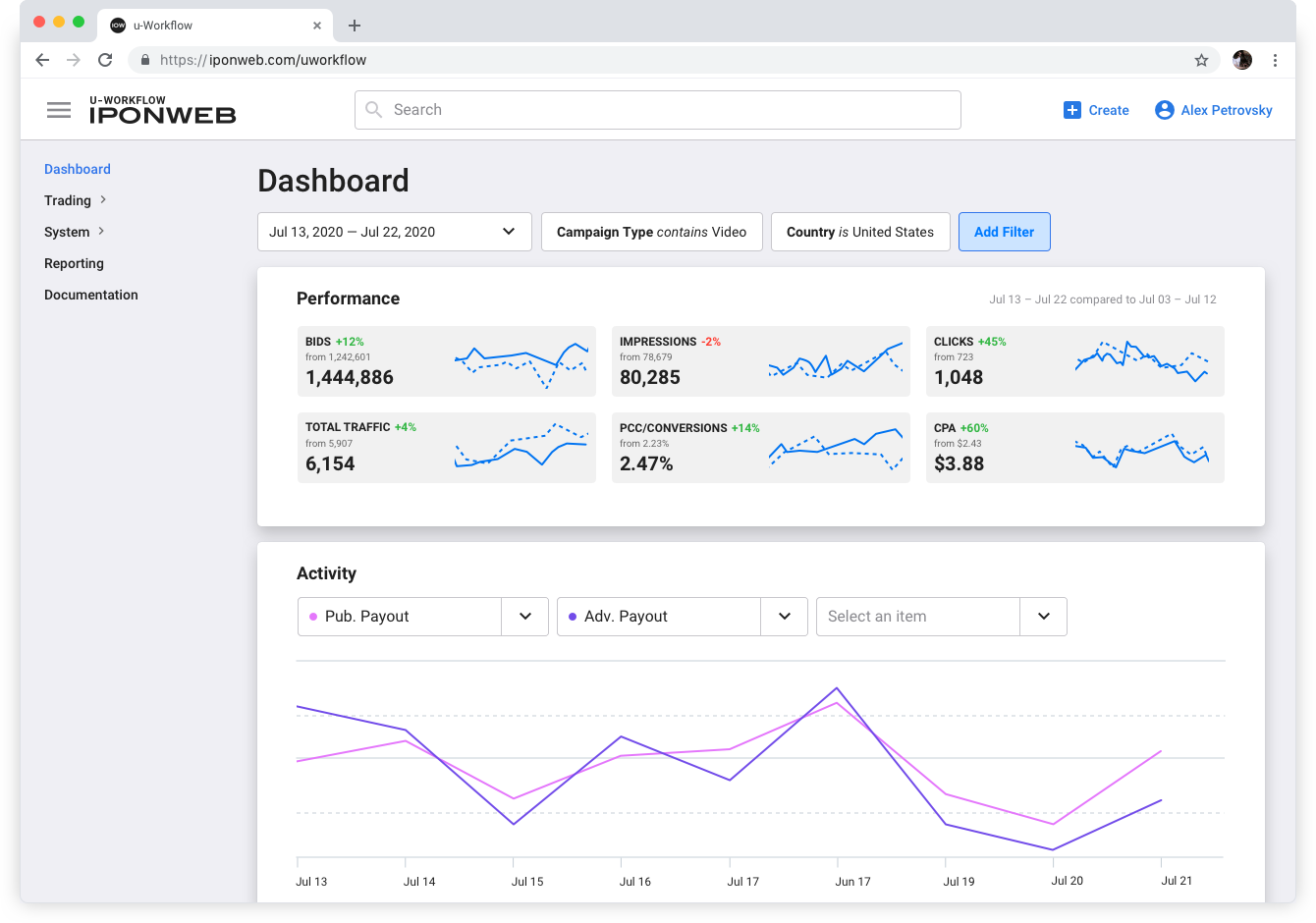
Based on feedback from clients and client managers, we have created a system of widgets that would universally cover multiple client scenarios. Using the widgets, we put together dashboards that provided instant visibility of key performance indicators and could be adjusted to the tasks of any relevant project. This enabled our clients to efficiently manage their Ad activities, in accordance with their role and scope.
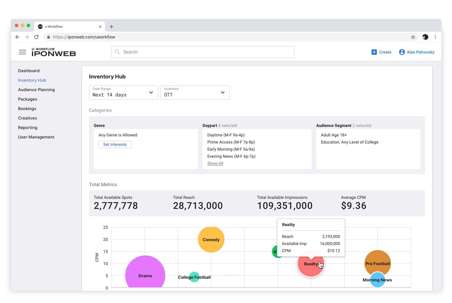
Here are a few examples of project dashboards created using the widgets. In each case, the metrics are defined by business needs and are used to track certain business areas.
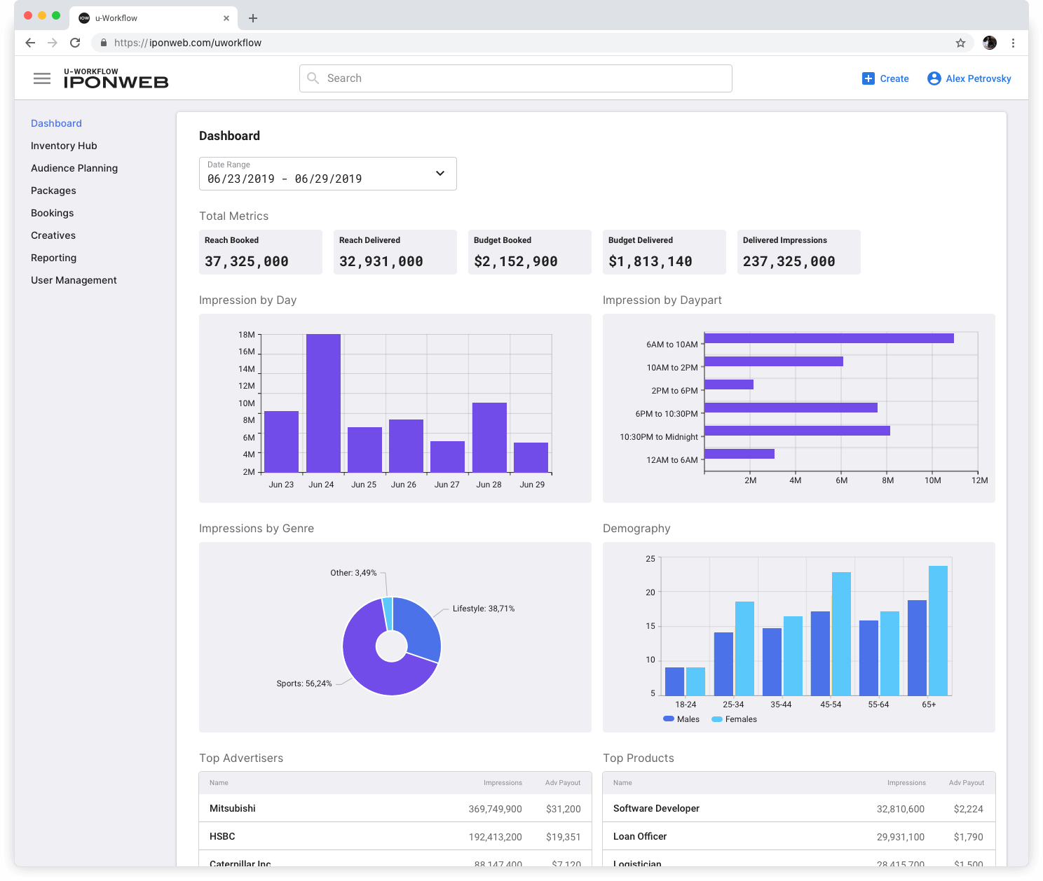
There are scenarios when the user needs to get visibility of a certain data set, and here the filtering functionality comes into play. The filters can be applied to lists and indicators.
Result
The feature has successfully mended the gap between adjustment and monitoring, as validated by user activity inside the product and positive client feedback. It has helped to create more articulated workflows and has improved the efficiency of day-to-day activities. The introduction of dashboards has enabled upselling existing clients and the launch of new client projects.
Case Study
Solving complex scenarios through easy-to-use UX for Targeting Management
Problem
The existing functionality of the targeting management toolset was not covering scenarios requested by large user groups and was providing a poor experience for certain more complicated scenarios.
Task
Enrich the targeting management toolset, to enable new scenarios, make the targeting functionality a smooth and fast experience for the user, despite the heavy math under the hood.
Solution
We have phased the solution so that we could iteratively collect business requirements – various types of targeting options – and implement the changes, validating them with the users. Further down, we would add new business requirements, and make sure to retain the ease of use and flexibility of the functionality, despite the underlying complexity of the targeting options. The flexibility of targeting options was maintained on both the UX and the tech architecture sides. The feature lifecycle continued past the implementation. The scope of business requirements kept getting wider, targeting options kept growing. The interface had to absorb all of the new requirements, as they appeared.
The missing ability to preview creatives during targeting set-up has been identified as one of the client's pain points and has been added to the relevant step of the workflow.
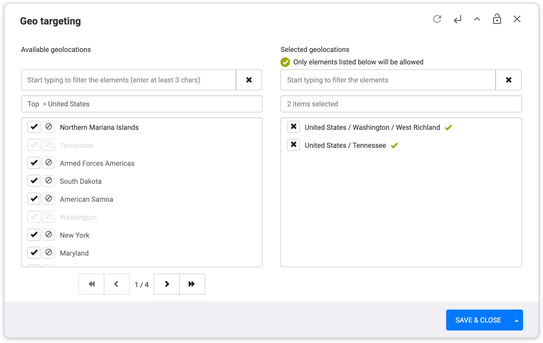
The old targeting functionality had no “exclude” option, hence users had to “include” multiple elements to rule one out. This has been fixed through the addition of include/exclude functionality, which could be applied even to targeting groups with multiple layers. This has also enhanced the precision of targeting set-up.
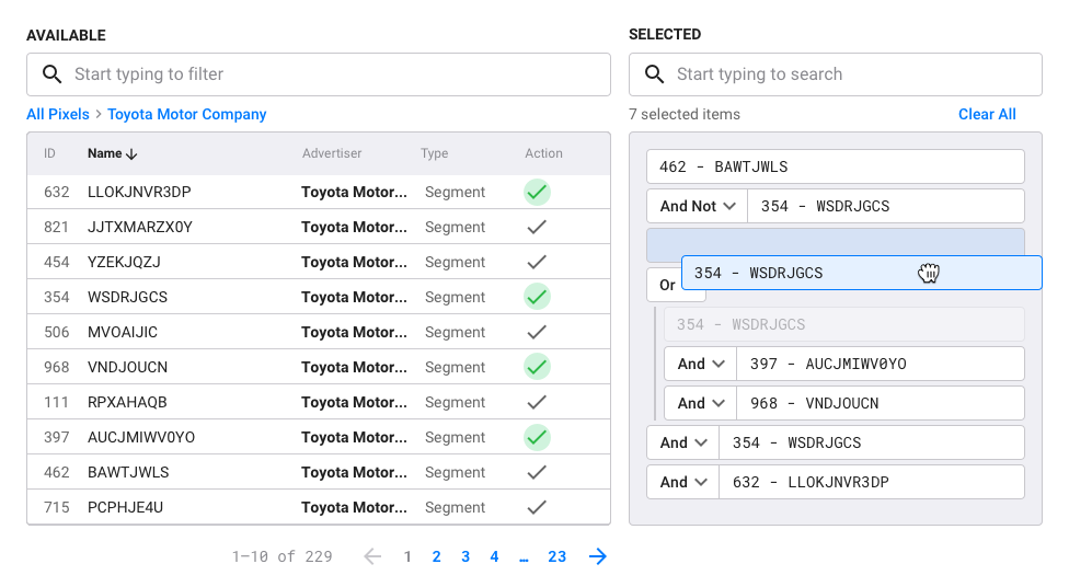
Like in this example – assigning pixel combinations for an ad campaign.
Result
The feature has enabled scaling the functionality to 10+ new targeting categories. Client feedback has demonstrated that the introduction of the new functionality has not complicated existing user scenarios, and has made them more focused on the clients’ specific needs.
Case Study
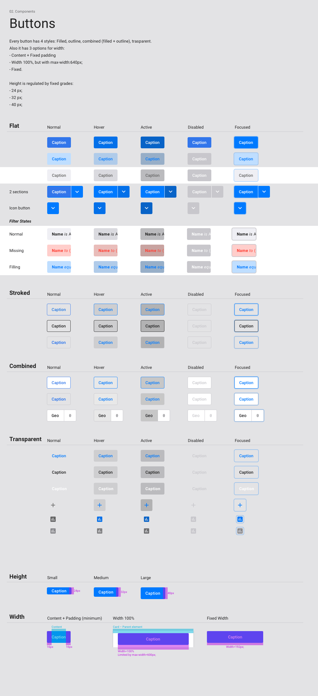
Adding UX Expertise to the Team. Creating a Flexible Design System
Problem
When I joined u-Workflow, the culture and structure of the team were engineering-led. The existing solutions were not systematic or flexible from a design stand-point. This was slowing down development and causing poor UX.
Task
My role as UX Lead was new to the team, and with it came a new layer/angle of requirements and competencies. In the long run, my task was to create and maintain a design system that would support fast product growth and ensure a consistent experience for the users. In real life, my first task was to build relationships and smoothen the communication with the development team, while introducing a new type of expertise.
Solution
I approached the solution from two perspectives: the development process and UX.
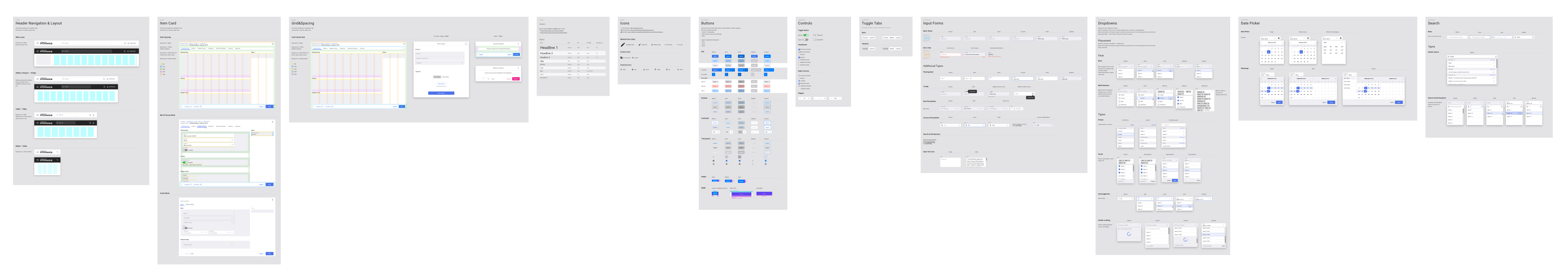
- Development process we have collaborated with the dev team to identify and optimize the range of components and modules that laid the foundation of the product. We have established a framework for growing the components library in a way that enabled scaling the product in a fast and consistent way. I've proposed to use existing libraries – this has allowed us to cut costs and resources, and speed up the development of design solutions.
- UX I’ve introduced more focus on the user needs that stand behind design decisions. For that, I’ve added research, user interviews, and validation as essential steps of the production process.
The range of business requirements kept growing – the design system had to absorb new requirements and the growing complexity of the product.
Result
Through multiple iterations, we have arrived at a flexible design system, spec'd out all the components and formal rules behind them. This system has allowed us to use existing modules in a systematic way, create new ones fast, and develop the framework systematically.

u-Workflow Experience Summary
I've become the person in the team responsible for making the product better from the user perspective. In order to achieve this, I needed to have a deep understanding of the business context, technical set-up, work with user feedback, and build relationships with internal stakeholders.
The result of the whole work was the creation of the product strategy for enhancing user experience and growing the functionality. Iterating along the strategy allowed us to delight current clients with our services, upsale them to new features, close sales of new clients, and on the process level – streamline development through systematic solutions.
Business expectations kept changing, which served as the opportunity to test the flexibility of solutions. After multiple tests, it became clear that the system works holistically, is scalable, and is ready to solve incoming business tasks.
The design system has been used successfully to create new products based on the framework.